Time for a change
As you might know, I’ve been gradually revamping this site, and today I turned my hand to improving the typography.
As you might know, I’ve been gradually revamping this site, and today I turned my hand to improving the typography.
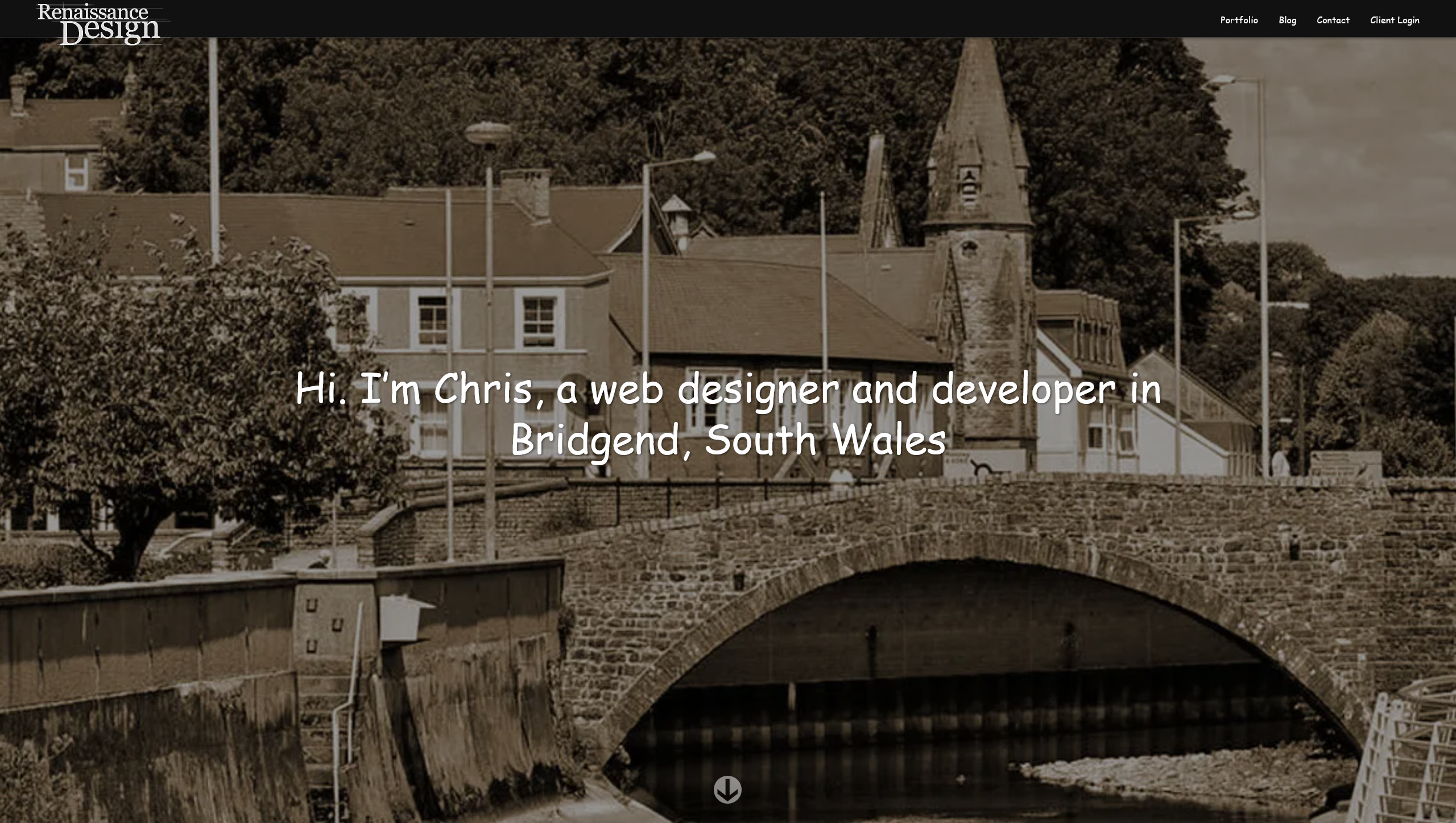
I redesigned this site recently. You might have noticed. Maybe not if it’s your first time here, that’s ok too.
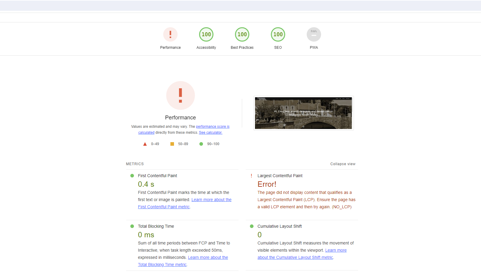
Those full page splash images with everything fading into view look pretty snazzy but there’s one small problem: the Lighthouse test’s Largest Contentful Paint test fails to pick up on any element that starts at opacity: 0, irrespective of the fact that it animates to opacity: 1 a second later, leading to the following error:
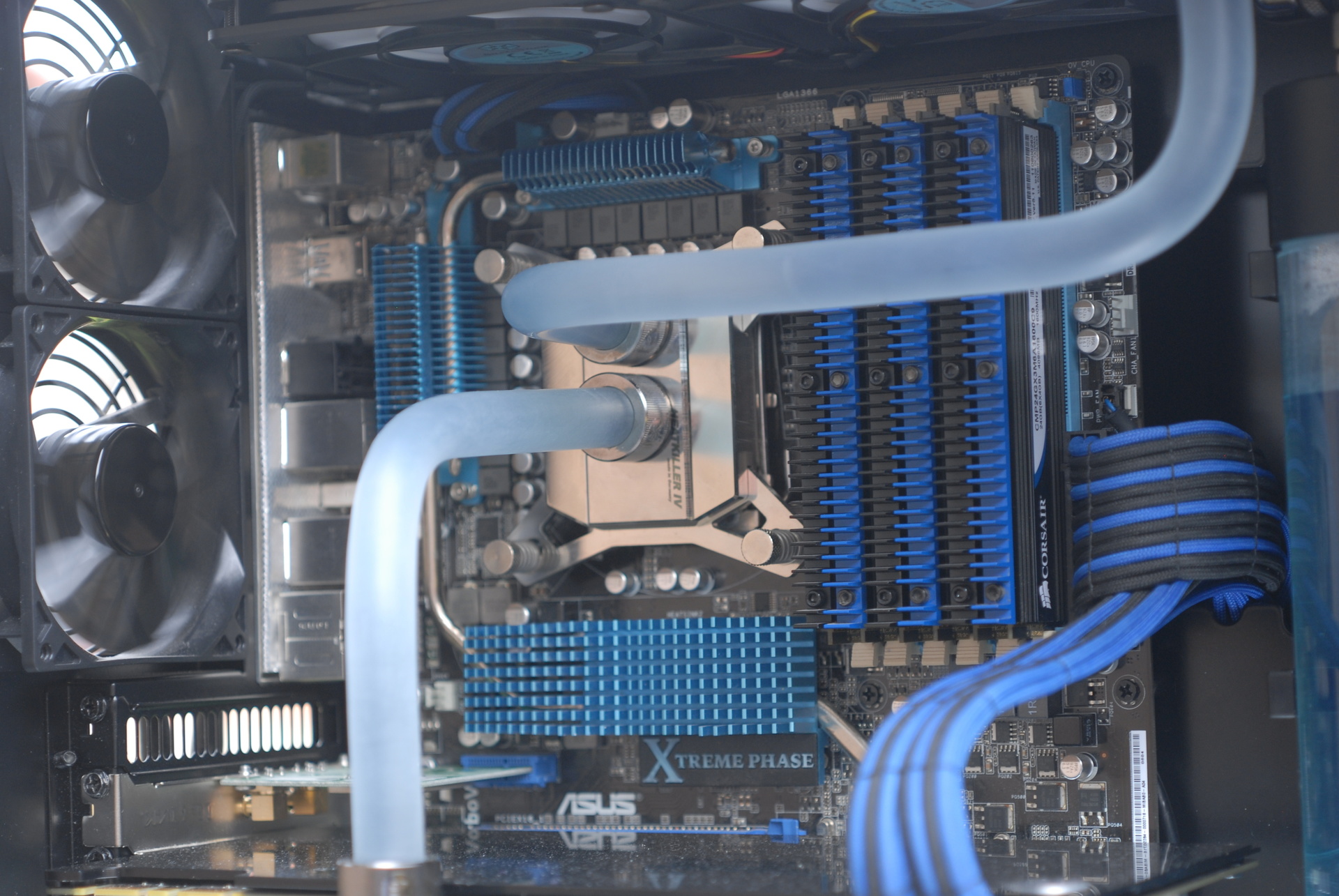
It’s been a while since I’ve written about the status of my homelab, and a lot has changed.
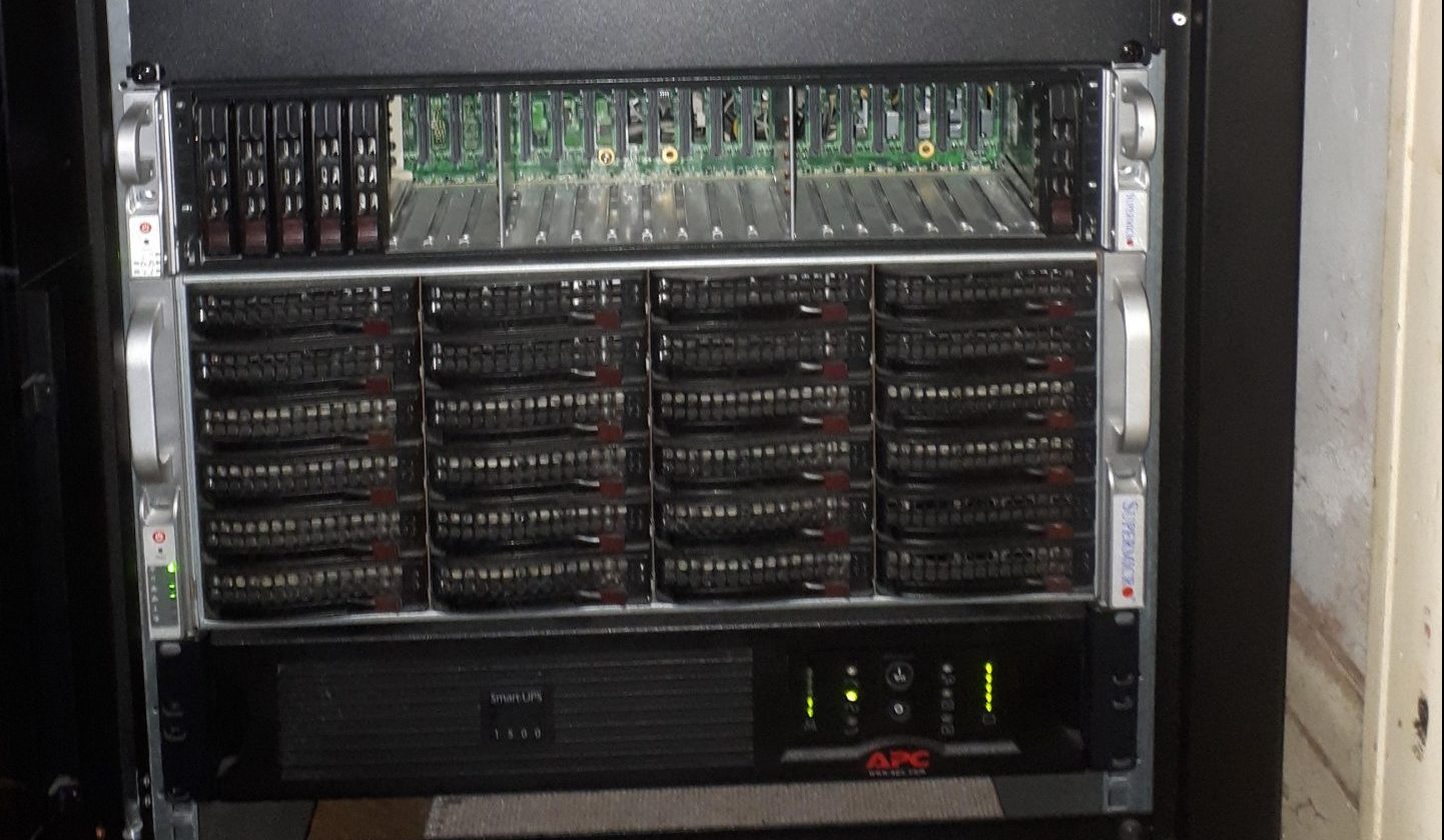
Obviously I couldn’t leave the big Supermicro box sitting on a table, that’s just untidy. I picked up an 18u closed rack cabinet from Prism. It’s only 800mm deep in order to fit in the space next to the front door, but there’s just enough depth to install Supermicro’s ball bearing rails.
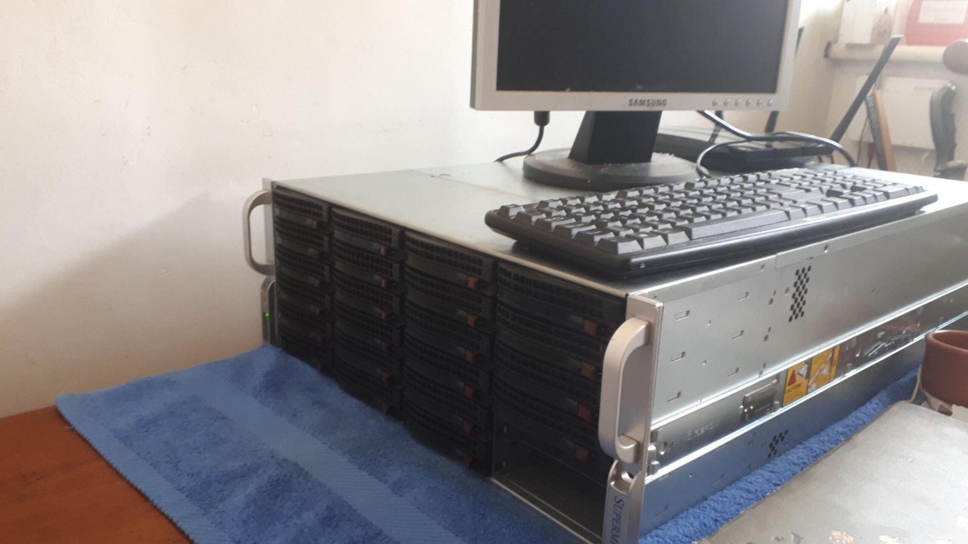
At least, I can’t. Between backing up the various machines around the house and the VPS this site sits on, my repositories of past projects and a fairly hefty collection of ripped media (if you have any early DVDs they’re getting toward the end of their lifespan) I was rapidly outgrowing the repurposed desktop that used to serve me as a NAS and VM host.
I spend a lot of my time creating digital artefacts. Sometimes it’s nice to spend some time working with my hands to create something physical and tangible, and what better project than making one of the tools I use every day quieter and more pleasing to the eye?
It’s been a while since I’ve written in this blog. For the longest time this site has just been a holding page, because I didn’t want to do anything on the redesign until it was perfect. The thing is though, it’s never going to be perfect, for any number of reasons: I’m too much of a perfectionist, I’ve had another great idea which I really should incorporate, I was busy redesigning my billing/project management software instead. I’d let perfect become the enemy of good, or at least of good enough.
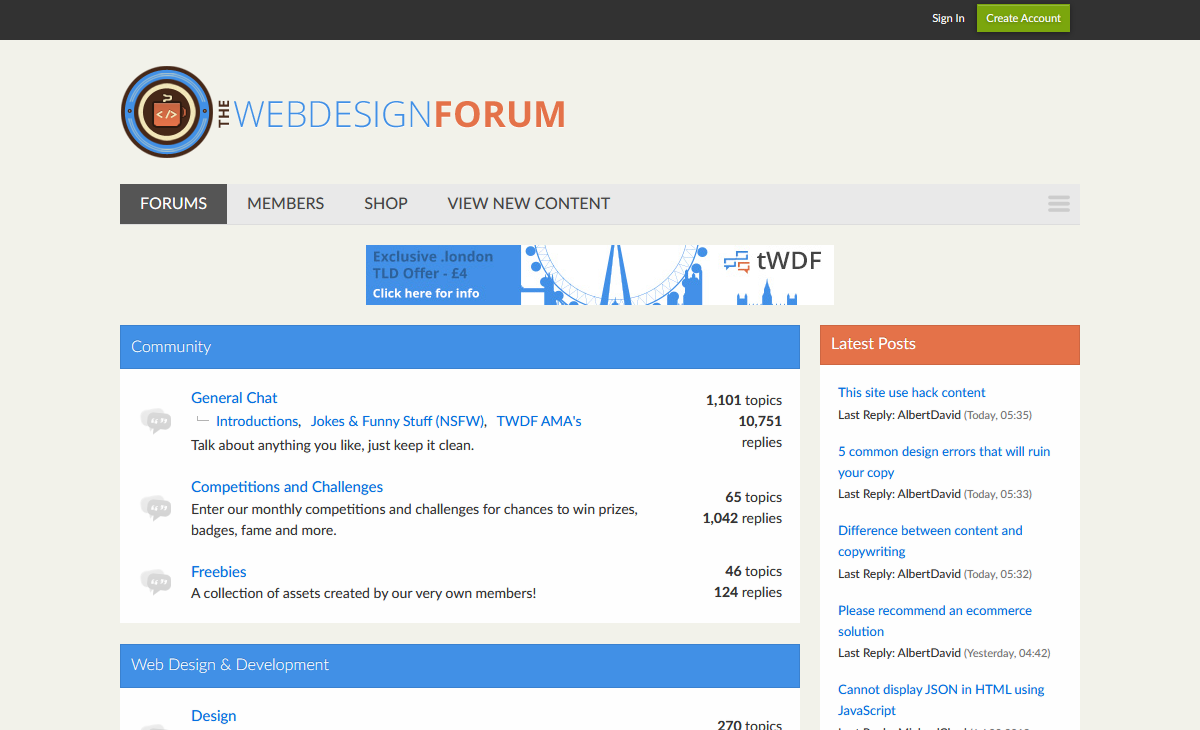
One of the first things people find when they’re looking around for information on any subject are forums. Forums are a great resource because they collect a community of knowledgeable people who actively help each other out, in addition to providing a huge searchable archive of information for people who are just looking to find the solution to one problem.
I’ve recently been involved in a project to create a forum for people who are interested in web design and development and all the disciplines (SEO, copywriting, content strategy) that go along with it, and it’s recently launched – without further ado, I present to you: The Web Design Forum.
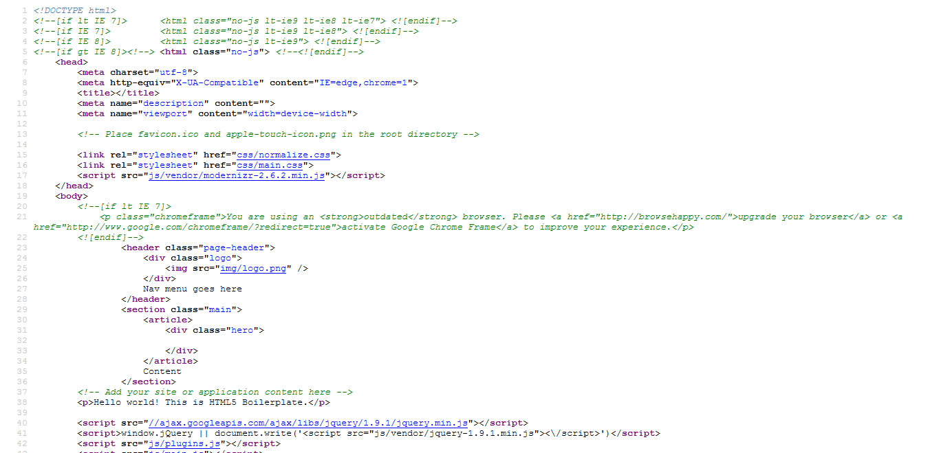
Responsible developers don’t work live. Working on a local copy of a site and only pushing it live when it’s ready is one of those sensible development practices that everyone should follow, but it can introduce some hitches when working with WordPress. Luckily, wp-config.php is the one core file that’s never overwritten by a WordPress update, so it’s safe to rewrite it to be a bit more useful. The wp-config.php file is generated from wp-config-sample.php by the WordPress install script and anyone who’s worked with WordPress will be familiar with the contents so I won’t list them in full, but you can view the default contents of wp-config-sample.php in the WordPress SVN repository.
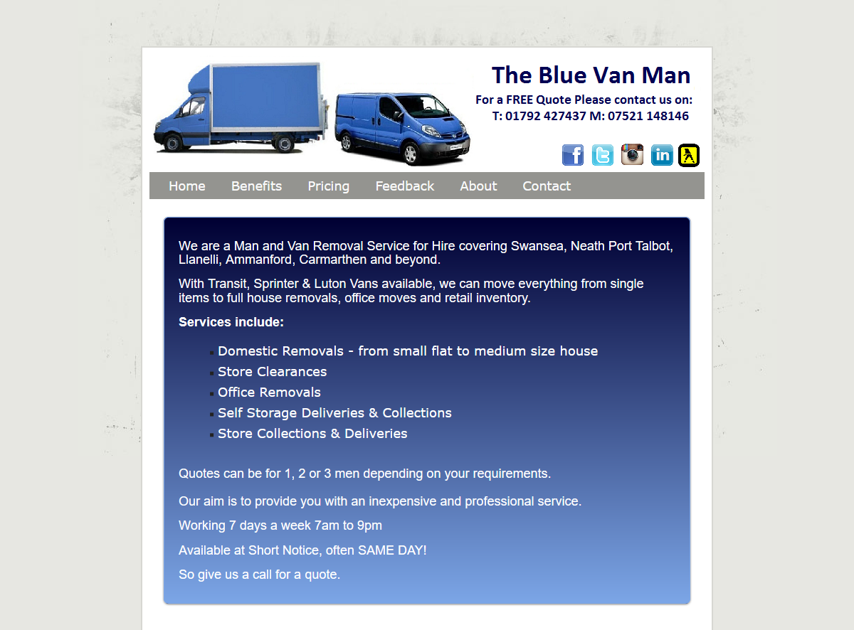
I moved my office this week. I didn’t move far (20 miles) and only had one van-load to move, so I scoured the local listings for a man & van service. I don’t know if you’ve ever looked for something similar on Gumtree or the like, but I’ll save you the trouble: an endless list of (often badly-written) ads ending with a first name and a mobile phone number.
The advantages of loading scripts from Google’s CDN are fairly obvious – for a common script such as jQuery, we’re on to a better-than-even chance that the user will already have the script in their browser’s cache from other sites, reducing the total download weight of your site. Even if they don’t, the file will be downloaded from their nearest Google CDN server, which will still be faster than downloading it from your site because it will be downloading in parallel from a different host.